Link to external website

Kiweno

Digital Health Platform

Rebranding a Digital Health Platform

A clear identity

Mock-up with floating Mac-book, yellow background, homescreen of the kiweno website

with purpose

  • Client

    Kiweno
  • Agency

    Empatic - User Experience Strategy
  • Role

    Branding
    ,
    Art Direction
About the Project

Kiweno helps people better understand and manage their health. Over time, the offering grew from home-testing kits to a full health ecosystem, including diagnostics, supplements, and comprehensive health content. The digital presence needed to evolve accordingly — with a structure and visual identity that reflect clarity, trust, and accessibility.

Challenge

With a growing personalized health market and an increasingly broad product range, clarity and trust became essential. The website had to organize complex health information, make product categories transparent, and offer a user journey that feels approachable — while reinforcing the brand’s identity as modern, empathic and supportive.

My Role

I supported the Empatic team during the redesign phase, translating the new brand vision into key interface screens and a consistent visual and interaction language. I helped build the foundation of a scalable design system that aligns brand identity, UI components and content structure.

Design Vision

The interface follows a clean, flat aesthetic with generous white space and clear typography to create calm and clarity. Saturated, natural photography adds warmth without feeling clinical. Modular layouts, pill-shaped visual elements, and a color-coded structure bring coherence to the broad product range and make navigation intuitive.

Outcome

We developed a modular design system that unified typography, color, imagery, and interface patterns into one cohesive visual language. Clear hierarchy and flexible layout templates improved orientation and helped users navigate the broad product range with ease. The updated key screens translated the refreshed brand into a clean, accessible, and trustworthy digital experience.

homescreeb within the motel one app showing search bar, hotel recommendations for Tiergarten Berlin and Frankfurt Römer, Urban Bio Breakfast service
Homescreen of the motel one app, teaser with view of a city with a mountain background taken from a balcony with green cushioned wicker chairs, showing text about Motel One Innsbruck opening.
Hotel booking screen showing a modern turquoise chair and white furry seat, with booking details for Motel One Innsbruck, including dates, guest count, rating, amenities, and a location map.
Image gallery with pictures from a hotel

Skills & Services

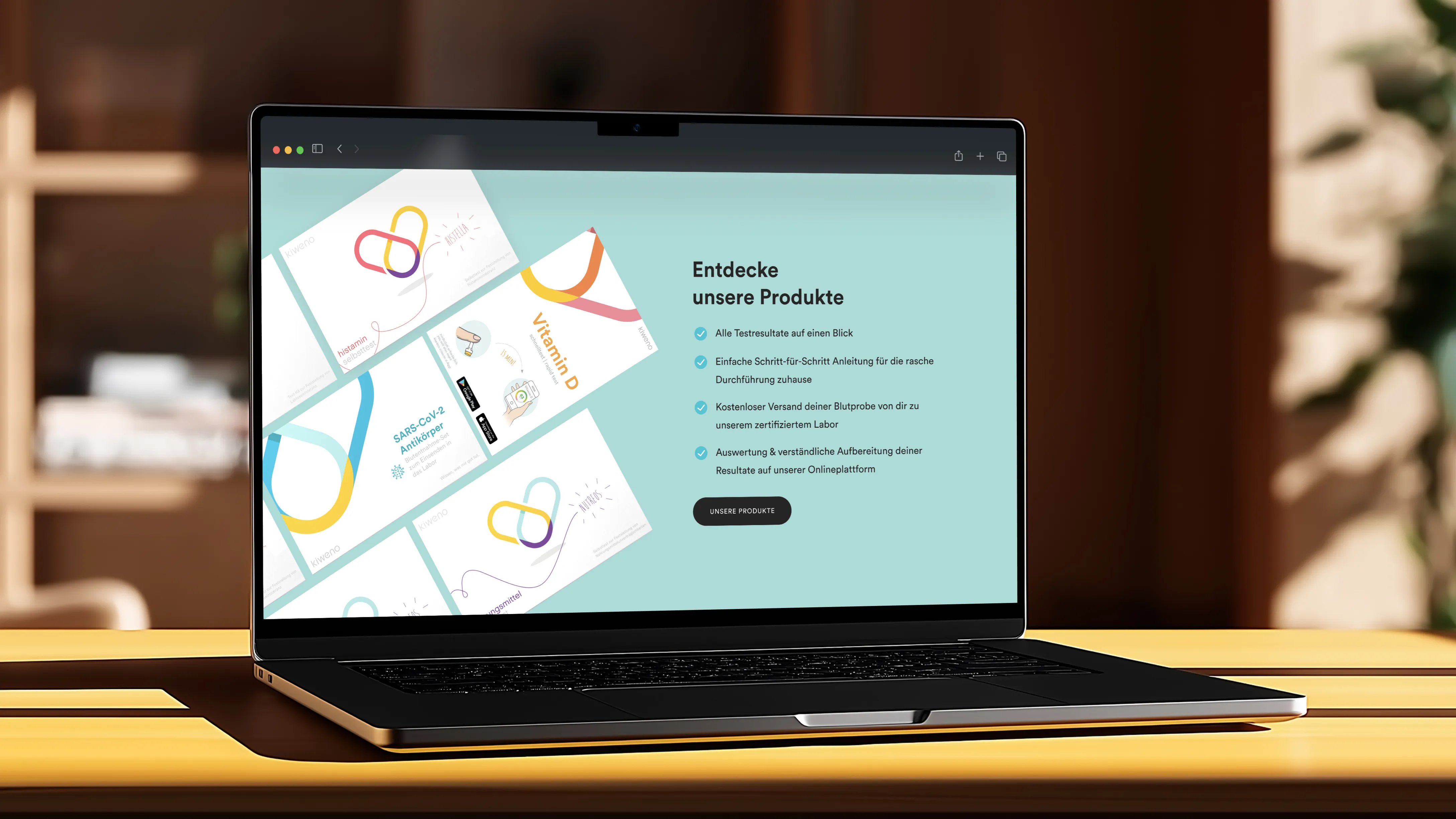
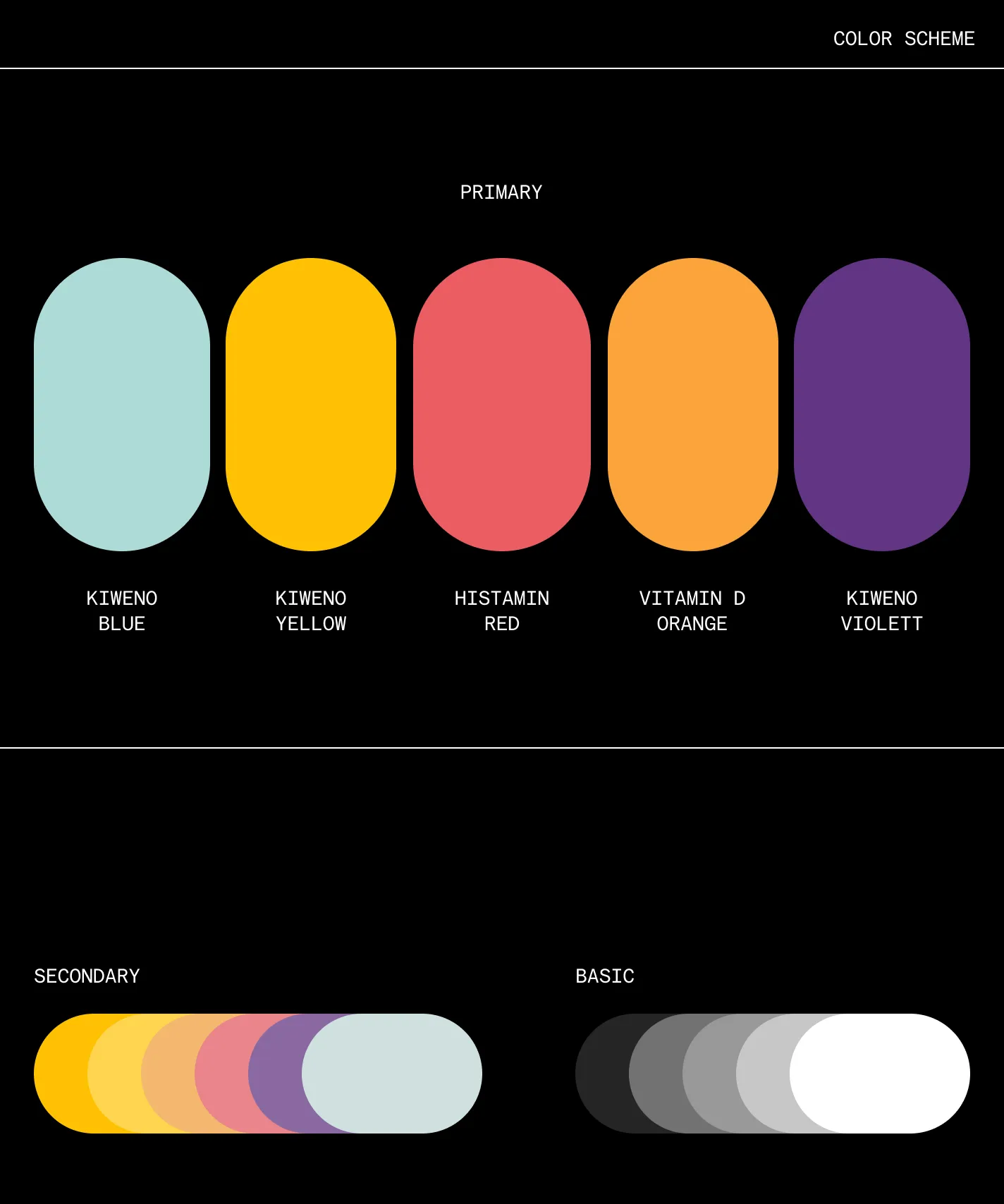
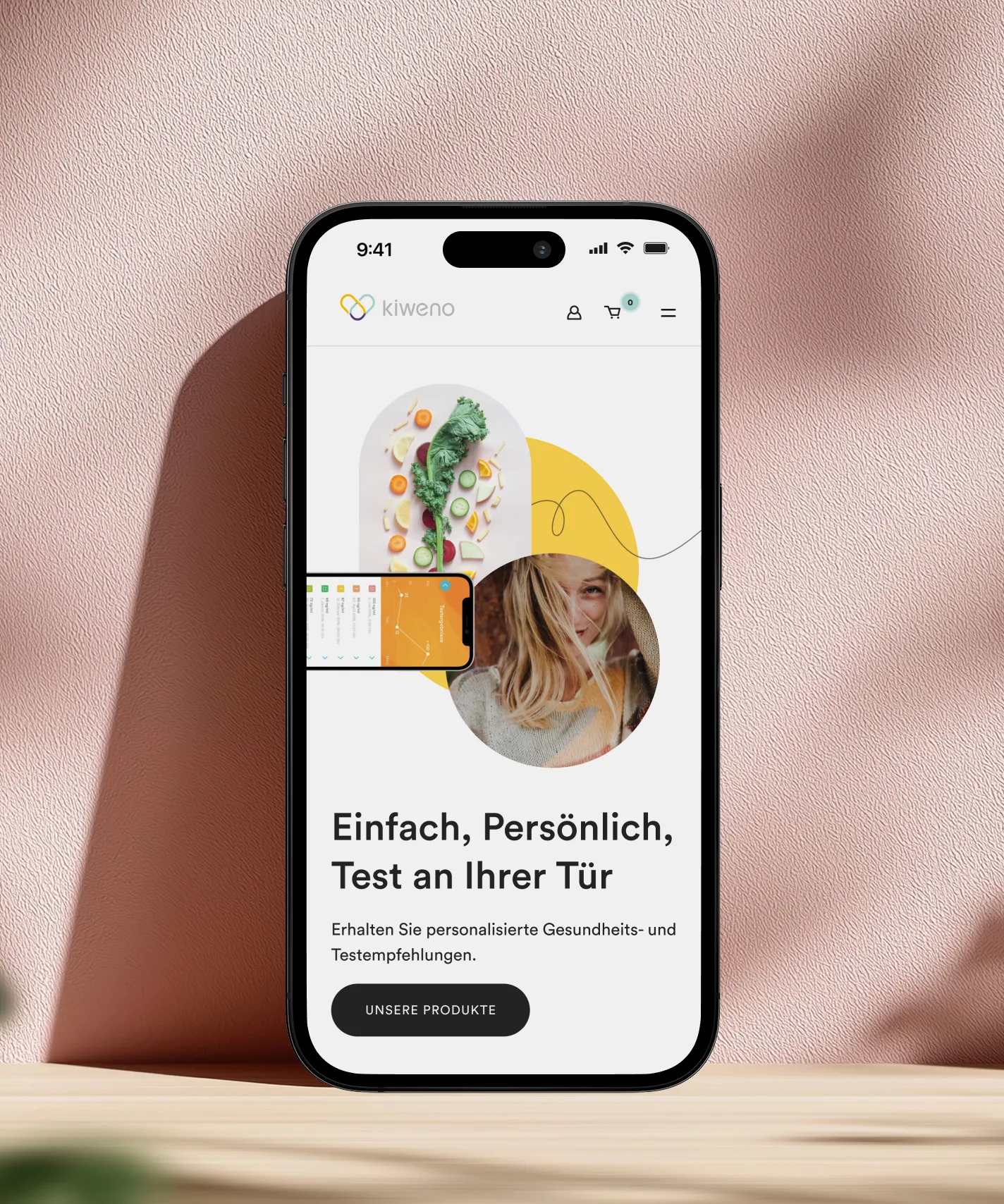
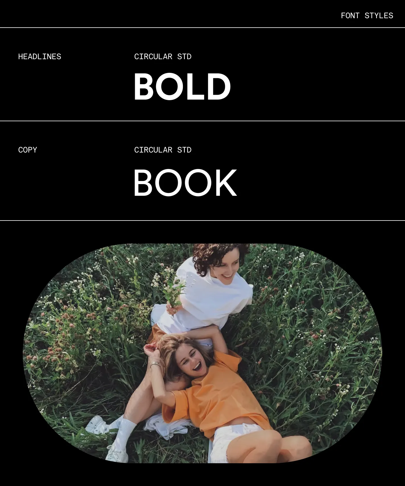
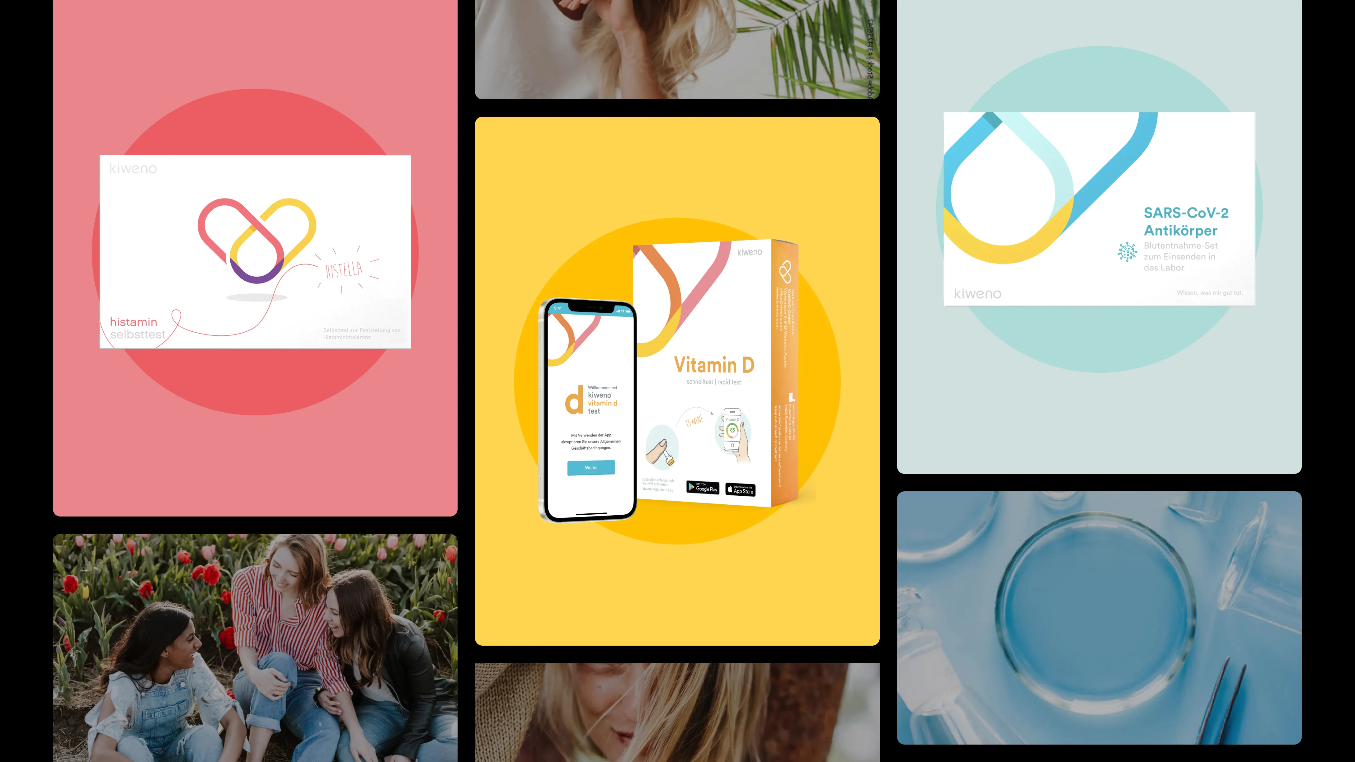
Branding · UI Design · Look & Feel Development · Design System Foundations · Art Direction · Requirements Definition

Credits & Disclaimer

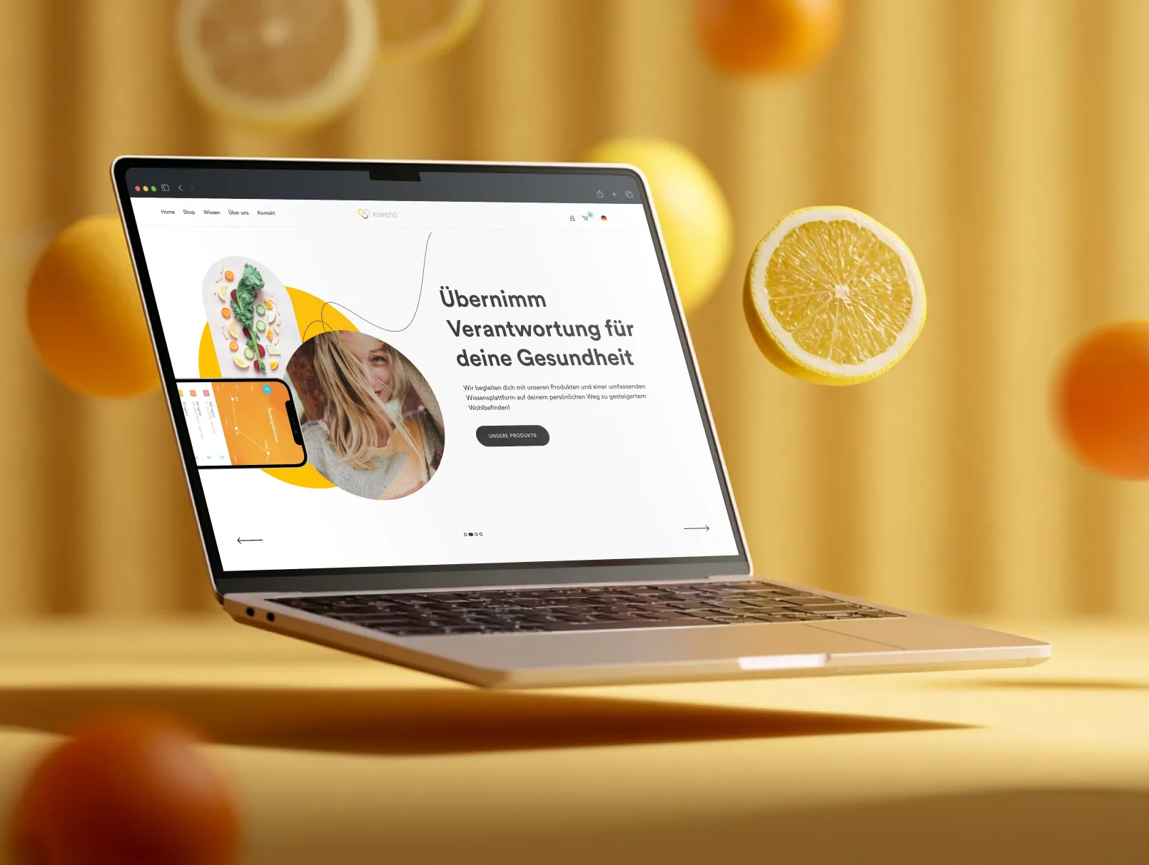
Rebranding and interface design developed during my collaboration with Empatic for Kiweno (Nov 2021 – Feb 2022).
Screens shown reflect the state of the product at that time; visuals, branding, and content may have changed since then.


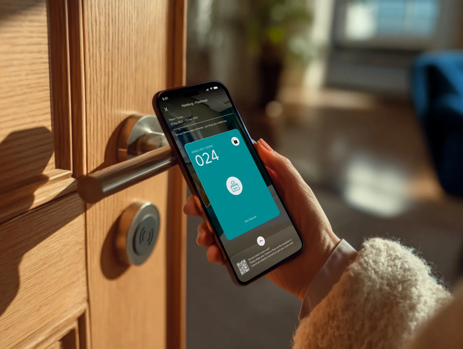
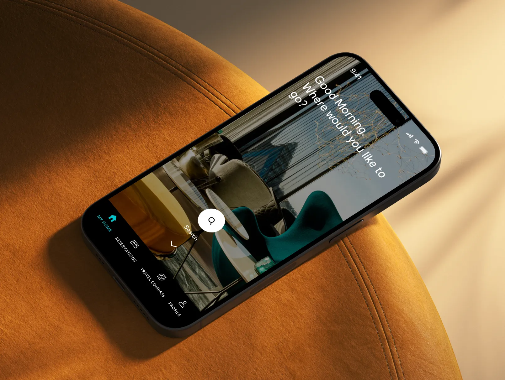
Mockups courtesy of Adobe Stock and LS Graphics.
Supporting imagery generated with Midjourney and sourced from Unsplash for illustrative purposes.

More Projects

More Projects

More Projects

Latest Projects

Latest Projects

Latest Projects

Latest Projects

Latest Projects

Latest Projects

Latest Projects

Latest Projects

Latest Projects

Link to the next project

Mobile Check-In & Digital Key

Link to the next project

Personal Travel Companion App

Link to the next project

Evie Health App

Link to the next project

Mobile Check-In & Digital Key

Link to the next project

Evie Health App